Ally Bank's Redesign of Authenticated Space - Communication Plan
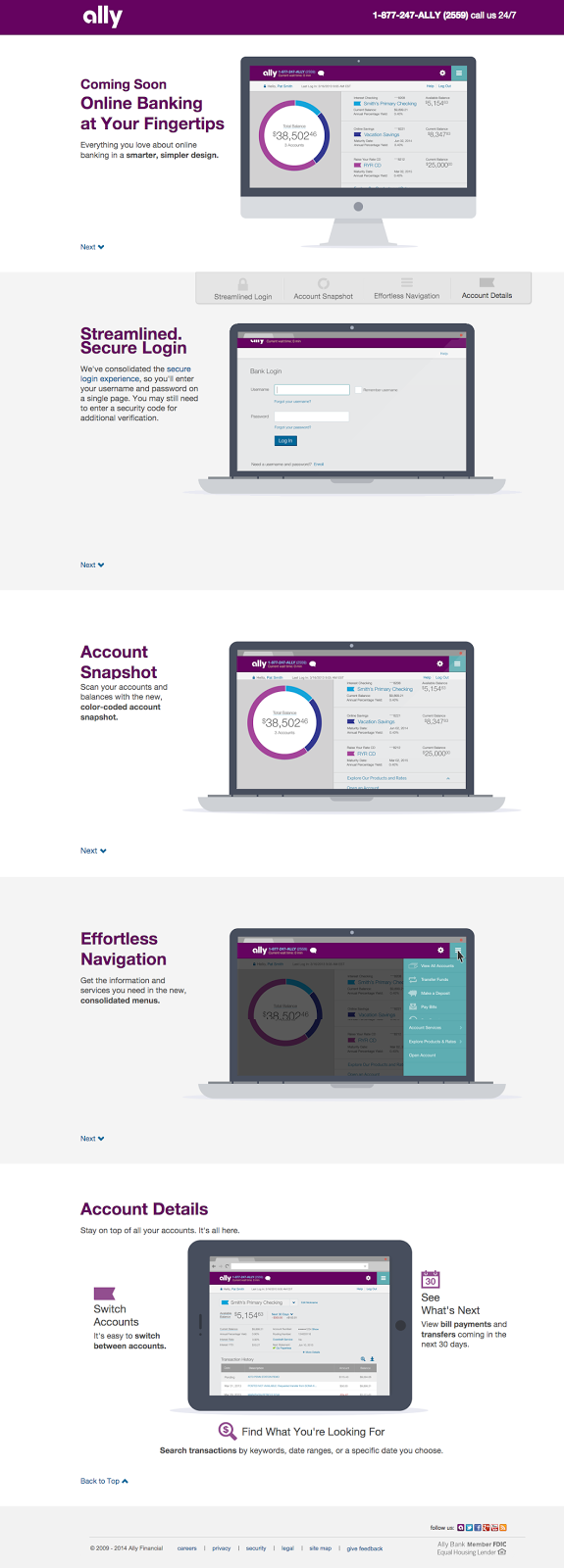
I wrote the content and developed the strategy for the communication plan for the release of Ally Bank's new design. It involved several emails to various customer segments, a landing page, a tutorial once users log in for the first time, and a few other marketing properties to promote the tablet-friendly redesign of Ally Bank's authenticated space.
Because this change is a big one for our customers, we had to plan the appropriate tone to make sure that we communicated the advantages of the new design. Inevitably, there will be some frustration with a change to the UI that is so dramatic, so part of my goal was to promote the advantages of the new design. It's sleek, tablet-friendly, and simple to use on every device, so I tried to message these benefits while sticking to the friendly, straightforward, down-to-earth Ally tone.
I also worked on the redesign of the authenticated space, which was a year-long project. It was exciting to be able to participate in its promotion.
You can see the long-scrolling, customer-facing page live here.


